

Designing logos
Today was spent designing logos. Multiple logos, all for one client, so they have a choice. So for today’s post I thought I’d write up how to go about designing a logo, what makes a good logo, and how I go about it.
First up, what is a logo?
Generally speaking a logo is a graphic or typographic symbol used to represent an entity. That entity can pretty much be anything from a person to an international company, a backyard gardening club to Microsoft. For the purpose of this blog, I will be looking specifically at artists and not-for-profits, with a dash of small business as this is my clientele and the people I am aiming to help.
What do you use a logo for?
Representation. It is equal to saying ‘I woz here’, or ‘This is me’ or ‘I rulz’, except minus the knife and the suffering tree. It can be used as a mark, like a signature – this is a factor often used by visual artists, including me. It can be used for identity and advertising – the golden arches of McDonalds is a classic example, and an apple used to be just fruit. Every good graffiti artist has their tag to be recognised, and this is no different.
What makes a good logo?
Many things have to be considered when designing a logo.
- First and foremost, the logo should be what it is aiming to represent. You do not use a teddy bear to represent a gun club, or a fish shape to represent a forestry business (unless perhaps they are Fisher and Co, or somesuch), or even Comic Sans font for a funeral parlour. The logo must portray the feel, the mood, the message, and information about the entity it is representing.
- Secondly it should do all the above in the simplest, most obvious manner. Having said that, a little artistic quirkiness doesn’t hurt. As long as the logo is saying what it needs to say, a little hidden meaning or symbolism or just plain clever design can add more. For example, the Gmail logo is both an ‘M’ and an envelope. It could have just been an envelope, but the added ‘M’ for Mail adds to the impact and uniqueness of the icon. Simple often equals clarity and readability. Why is this necessary? Keep reading.
- It must be unique. No logo should look too much like any other, unless it is attempting to steal another logo’s mojo. Ever seen Eddie Murphy in ‘Coming to America’? There is a blatant rip off of McDonalds in the storyline – on purpose for humour’s sake, but in reality ‘McDowells’ could never get away with their ‘golden arcs’.
- Simple is best. Why? Because logos are used in a whole variety of ways. A good logo should be designed to:
- Be both large and small – it should work well as a tiny icon on Facebook and as a skyline improvement on the world’s largest billboard. Small is the greatest challenge – too intricate equals unreadable or unrecognisable at small sizes.
- Work on multiple different kinds of backgrounds. The logo may not always be on a white background. Inverted versions and gray backgrounds should always be considered. If the chosen design does not work well on anything but a white background, this should be considered in all future use of that logo.
- Have its own colour palette. Cadbury has trademarked a particular purple, KFC loves its red and white, and dare we mention Coca-Cola red and its impact on the planet? Choose your colours, make them work for you – use them across your branding to support your logo. Speaking of colour, your logo should also work in black and white, grayscale and inverted. Keep your options open.
- Work across different orientations. Facebook icons are a classic example – long, horizontal or vertical logos do not work well in the mandatory square format required for Facebook (or many other online networks). So a version of the logo will need to be designed to fit a square format. Logos can have different forms for different uses, but they must be recognisable as that logo. The layout differences between a business card, letterhead, website header, etc, must all be considered. How would it look in three dimensions? How about animated? How would it move (check out some of the movie studio logos, some gorgeous animated design there)? You never know what you might end up using that logo for. Ultimately the best logos work well in any format – again McDonalds is a classic example.
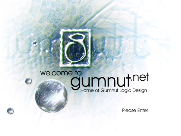
This was the splash page for my very old website when my business had another name and another logo (I was never really happy with either), however here you can see the basic logo look (yeah, underwater, what can I say, I was in love with the ripple effect – and that is not a good enough reason to use it in a design!).

And here you can see that same logo being adapted and used in a three dimensional setting. In this case the key is real, but the logo was photo manipulated into the third dimension, however if need be, I could produce this logo as a molded plastic or metal trinket, or even as a giant sign outside a shop. You never know what you might end up using your logo for, so keep your possibilities open as much as possible.
And where do you use your logo?
Everywhere. On all your stationery, on your website, you can use it in your signature in your email, on signs, on everything you produce. It is part of your business’ identity. You see the golden arches, you see McDonalds. You want people to see your logo and see you. It is shorthand for what you are.
As a visual artist my logo is an adaptation of the gumnut signature that I put on my artwork. It’s on my jewellery, my website, on the pdf with the logos I designed for my client today, it is even in my handwritten signature I sign my tax form with. Now that is a bit extreme (I doubt the owner of McDonalds has arches in his siggy), but as a visual artist, my logo is more tied to me as a person than Microsoft is to Bill Gates. Use it wherever you need to leave your mark. ‘I woz here’, ‘I am here’, ‘This is me’, ‘I did this’, ‘This is my stuff’, ‘You like this? Want more? Well, this is me and these are my contact details.’ Handing over a business card is more professional and easier than writing your phone number on their hand or giving them a scrap of paper.

Front of my business card.
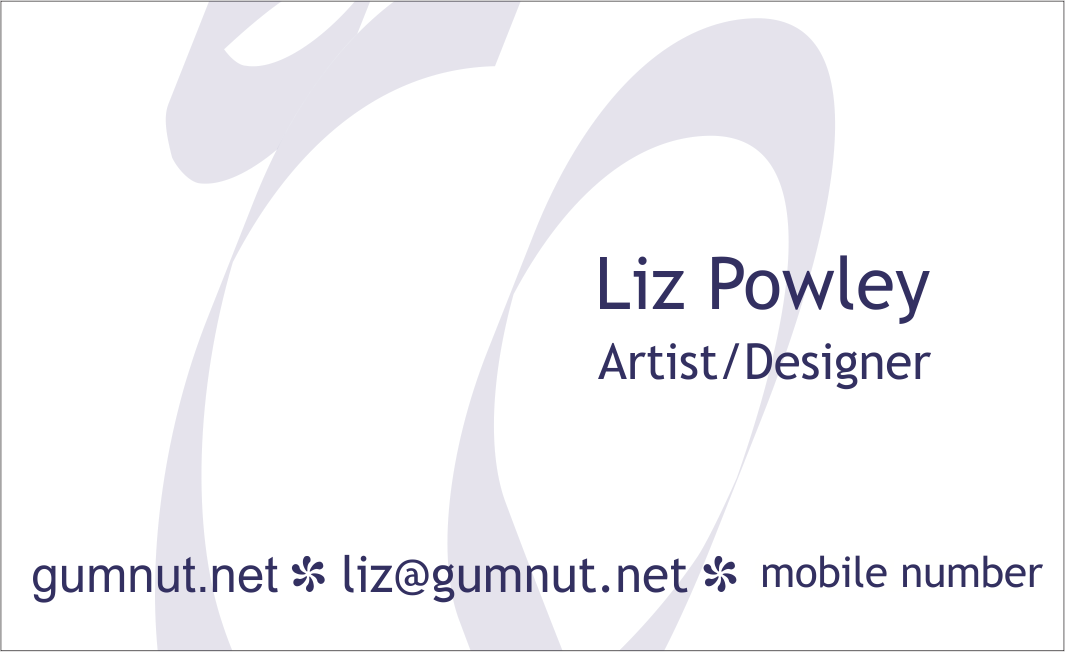
The back of my business card.
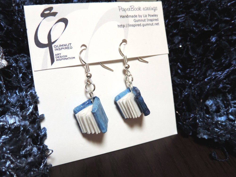
Logo on my earring packaging.

The handwritten version of my logo in my signature.
And a quick note on what not to do with your logo.
Please, please, please do not insert your logo into a document and, because it doesn’t fit properly, SKEW it or SQUASH it to make it fit. You can have the most fantabulous logo, but if you CRAM it into a space it is not designed to fit into and warp the image, the message that you are sending to possible clients or customers is that you can’t be bothered or you don’t have the technical skill, so why would they want you or your product? And besides, I hate seeing MANGLED logos, so I might materialise at your side and thwap you with your own mouse. Always scale in proportion.
Use your logo consistently. Don’t change its orientation unless you have a very good reason. Leave a decent amount of space around it so other graphics or text don’t impinge on its message. Use a good quality image for printing – I will thwap you with your mouse if you use a tiny jpeg image from your website on your printed business card. Web and print images have completely different requirements (but that is another blog post, at another time). If you can see jagged pixels, don’t print it. And, if possible, never photocopy a photocopy.
At all times remember that it represents you. Treat it like you treat your clothing or makeup. Keep it neat and tidy and presentable. Make sure it is something you would like people to see.
And I will end this here. I have no doubt I have forgotten something, but I must be back to logo designing for my client. If anyone has any questions, don’t hesitate to ping me here or on any of my social network accounts.
Best wishes,
Liz

Good one Liz…..Jenny at Splashout 🙂